Arapaper Toilet Tissue Brand Design
Brand Design / Logo Design / Packaging Design

Brand Design / Logo Design / Packaging Design
Arapaper approached us to design a brand identity for both their parent company and their toilet tissue product line. The project required creating a simple, typographic logo for the parent company and a softer, more approachable product logo for the toilet tissue line, along with a visual system to differentiate between tissue types.
Arapaper
Logo Design, Brand Identity, Packaging Design, Visual System Design
2023
Brand Identity, Logo Design, Pattern Design, Packaging Design
Completed
The client needed a way to clearly differentiate between different toilet tissue products in their line while maintaining brand consistency. Each product needed to be easily identifiable by consumers based on its ply count and quality level.
We developed a comprehensive brand identity system that included a clean, typographic parent company logo and a softer, more approachable product logo. The unique pattern design system uses number circles to denote the ply count, while color coding further differentiates between tissue types.
The final brand identity system provides Arapaper with a cohesive yet flexible visual language. The combination of patterns and color coding creates instant product recognition, while the number circles provide a clever and intuitive way to communicate the ply count to consumers.
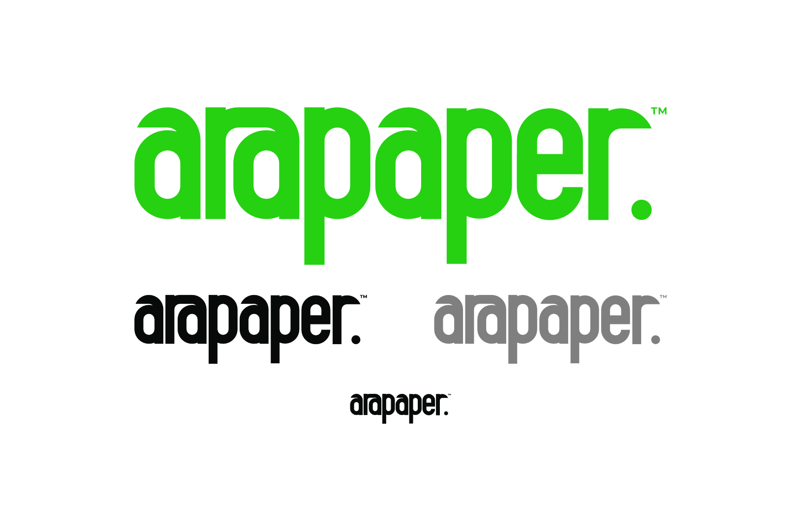
Simple and typographic logo design for the Arapaper parent company.
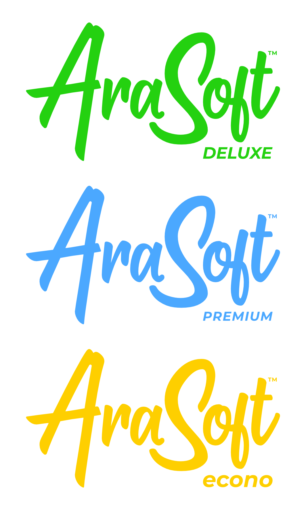
Soft, approachable and familiar product logo for the Arapaper toilet tissue line.

Unique pattern design where number circles denote the number of plys in each tissue type.

Each tissue type is denoted by a specific color in addition to the unique pattern design.

Overview of the complete Arapaper toilet tissue brand identity system.